Pharma/Healthcare Direct Mail


pharma/healthcare direct mail
Reaching HCPs has always been challenging, and the absence of face-to-face meetings has made it even more difficult.
With interactive elements, movement and technology our designs get past gatekeepers to HCPs. Video mailers put product info right before their eyes, while Web Keys drive them to your online information. Our tabbed and sectional designs help them to help patients by making complex information easier to navigate. Look below to learn how Pharmaceutical companies and their agencies are using Red Paper Plane to get more results from less budget.
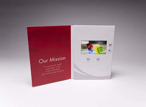

Deliver a Video Doctors Can Watch At Their Convenience
65% of executives visit the marketer’s website and 39% call a vendor after viewing a video. Red Paper Plane's Video Brochures and Mailers are perfect for education and to preview online resources.
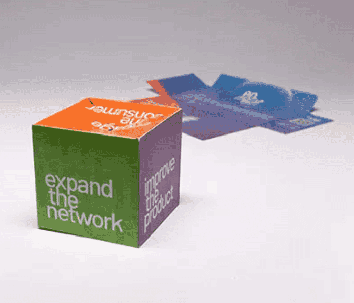

Capture the Attention of HCPs
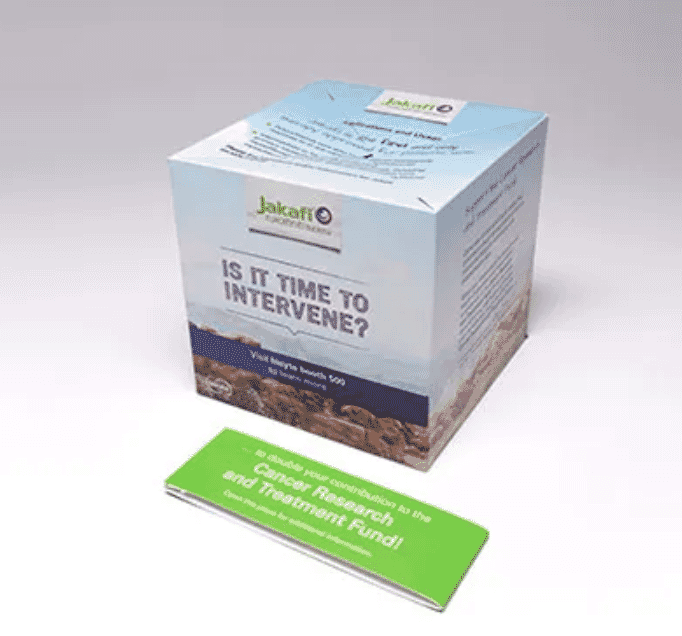
Mailing flat and popping into a fully dimensional cube, this design has undeniable staying power. It transforms into a desktop reminder once opened. It’s surprising, memorable – and very affordable. Hundreds of healthcare promotions have included our Pop Up Cube.
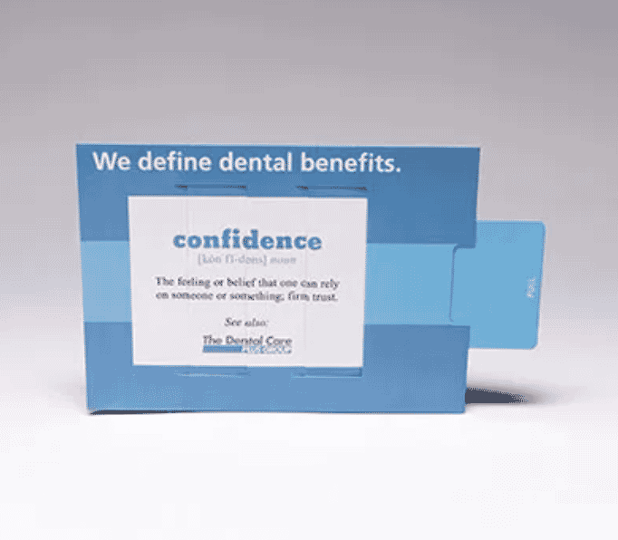

Educate Patients & Doctors
This is our Magic Changing Picture. It’s the perfect tool for communicating before/after, or perception/reality comparisons. It’s far more powerful than a postcard, and at under $2.25 each for 2500, a very affordable way to change people’s perceptions in an impactful way.
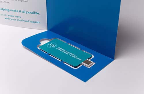

Drive Doctors To Your Online Materials
When inserted into a USB port, Web Keys take recipients to your pre-programmed URL. This is one of the many ways you can combine a high-impact print format with a digital element.
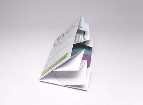

Marketing Results that Explode
Dimensional mail delivers the best B2B response rate of any direct mail at 8.51%. Our Exploding Page mailer increases to twice its size once opened, allowing you plenty of real estate for content and messaging.

Increase Patient Compliance
Education is the key to patient compliance, but medical information can be complex and intimidating to most people. Breaking it down into easy-to-understand sections helps. This is just one of our designs that let you feed readers information in sections, rather than throwing it at them all at once.