Every brand has value, but it’s up to marketers to make others aware of it. Which are the most compelling elements to include in a value proposition? And how does one capture the attention of their target audience and stand out from the crowd?
Well, for Bank of Utah, the answer was simple: Red Paper Plane.
According to Marketing Coordinator, Cherie Hanson, the Bank had the goal of acquiring new business through an omnichannel campaign.
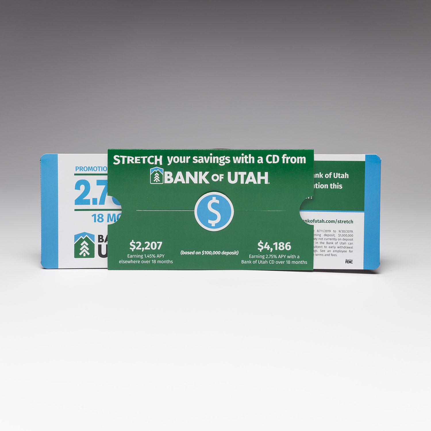
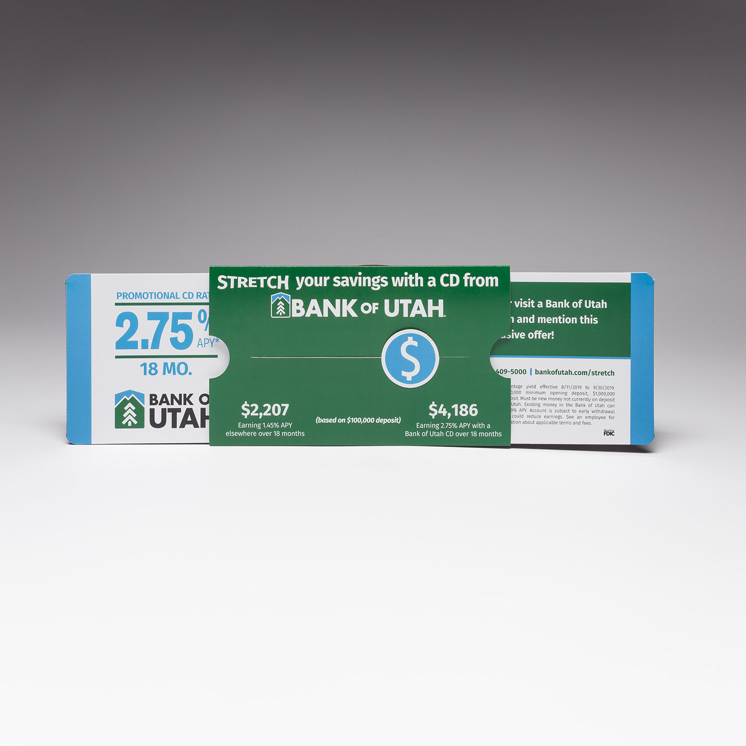
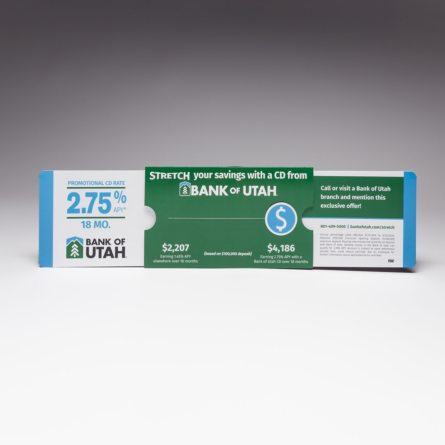
“We wanted to create a high-impact campaign that would 'wow' our audience in print, electronic, and person-to-person communication,” she said. “It was important that the artwork was uniform through all the visual channels. With electronic media, animation is easy. We wanted our print piece to be equally eye-catching with similar movement. The Circle Extendo® by Red Paper Plane helped us achieve that.”
“I was amazingly surprised at how easy it was to use Red Paper Plane’s online interface,” Cherie said. “I just downloaded the template and then I was able to play around with it, moving artwork around until we got it just the way we wanted it. Then I uploaded it and it turned out just the way we envisioned.”
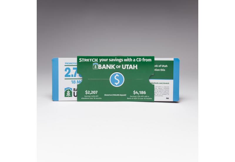
The Circle Extendo® is a version of The Extendo®, one of Red Paper Plane’s most popular designs. Two hidden panels, moving in opposite directions, are revealed with the pull of one tab. A circle, which can be customized with a graphic, logo, or additional branding, slides across the cover as the tab is being pulled. This is a fantastic piece to showcase a before-and-after, transition, or two sides of a single story.
THE RESULTS
With this campaign, the Bank of Utah has already seen a return on their investment. Within the first week, Cherie said they had 21 new acquisitions equating to more than $3 million in deposits.
“I think everyone was very impressed with the Circle Extendo,” she said. “It was a very high-quality piece. It was a very niche piece to a very niche audience, so I think it was very well received.”
