Company News:
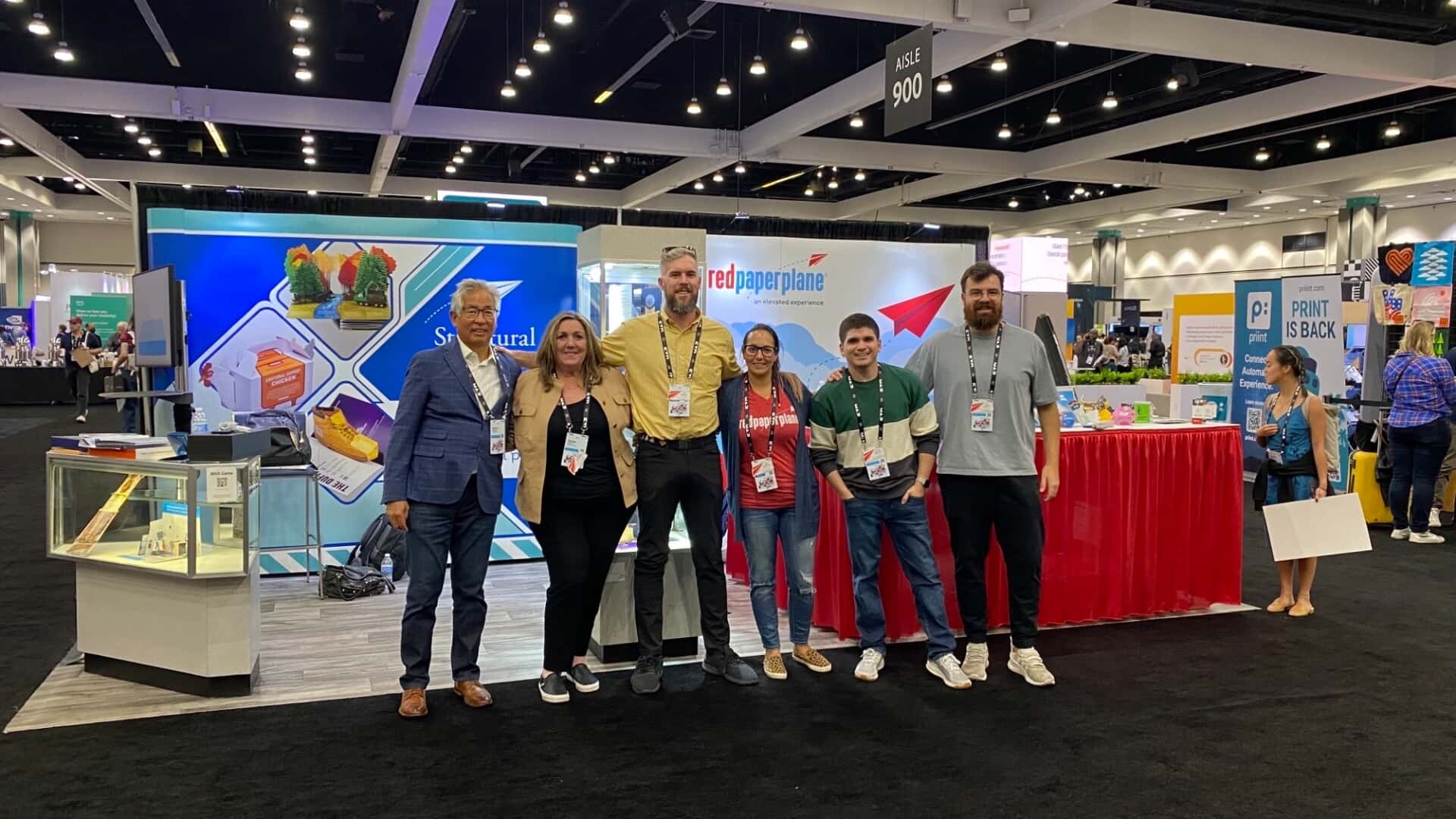
Red Paper Plane was a proud sponsor of Adobe MAX 2022 in Los Angeles, California. The three-day conference was a designer’s haven as over 7,500 creative minds came together at the Los Angeles Convention Center, and with another 264,000 joining virtually. Other sponsors included Meta, Tik Tok, and Dell, to name a few. Our team, consisting of both Red Paper Plane and Structural Graphics colleagues, was thrilled to be able to speak with hundreds of current and future clients.
The Red Paper Plane Sample Deck was given to all attendees in their Attendee Bags when they arrived at the conference. To say it was the talk of the town is an understatement. Recipients were blown away by the interactivity of the pieces and the “Wow” factor that they produced.

This year’s Adobe MAX was one for the books, and we’re already looking forward to next year’s. If you met with us at Adobe MAX, make sure you give us a call and tell us all about your experience!
--
University of Southern Mississippi Foundation Achieves Record Attendance
Who: The University of Southern Mississippi Foundation
Their Industry: Higher Education/Fundraising
Their Audience: Alumni and Friends of the University of Southern Mississippi
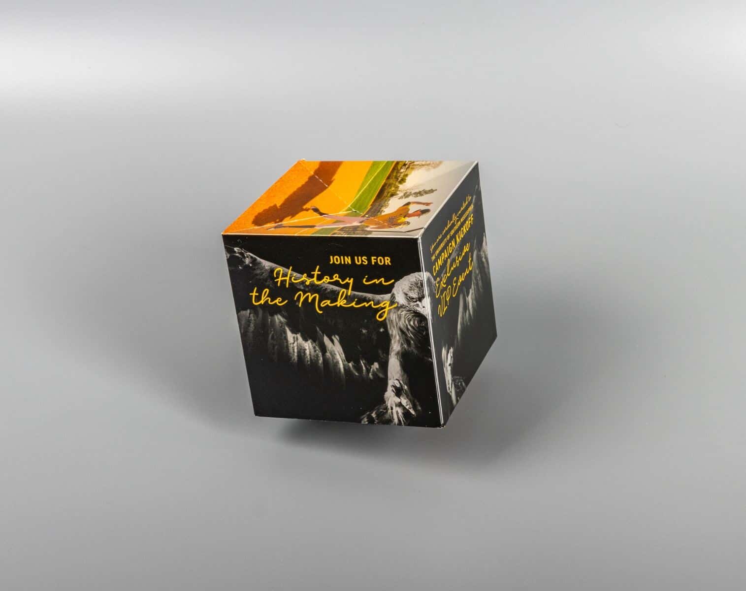
Their Challenge: To excite and entice donors to attend their capital campaign kickoff event Our Solution: 4.25” Pop-Up Cube with Band
The Main Pro: The 4.25” Pop-Up Cube with Band is exciting and interactive and helped USM Foundation achieve a record attendance rate. The cube pops into shape after being removed from its bellyband holder, ensuring you have your recipients’ attention.
The University of Southern Mississippi Foundation is a non-profit organization that oversees fundraising efforts at the University of Southern Mississippi. Their Mission Statement says, “the mission of The University of Southern Mississippi Foundation is to build relationships with alumni and friends in order to secure private funds and other resources for the benefit of The University of Southern Mississippi.”

This event was particularly important, as it served as the public launch for the most ambitious fundraising campaign in University history – Give Wing: The Campaign for Southern Miss. The Foundation’s goal was to make the event as experiential as possible. That includes every detail, all the way down to the invitations, so, it makes sense they would turn to Red Paper Plane. After having been previous customers, they knew one design, in particular, would make a perfect invitation for their event – the 4.25” Pop-Up Cube with Band.
Briana Dubaz Pfarrer, Manager of Donor Engagement and Stewardship at the USM Foundation, had nothing but good things to say about their past experiences with Red Paper Plane. “We love the different variations of products and how eye-catching they are. They always get such great reactions, so we knew exactly where to look for this event.” The 4.25” Pop-Up Cube with Band is an impressive size that demands your attention. It mails flat, thanks to its bellyband, but remove the band and watch the Pop-Up Cube pop into shape. Briana added, “Every aspect of this event needed to be an unforgettable experience for our donors, and we think the Pop-Up Cube fit perfectly with what we wanted to achieve.” Thanks in part to the 4.25” Pop-Up Cube, the USM Foundation saw a record attendance rate at their kickoff event. We’re looking forward to the next project with the USM Foundation!
--
4 Ways to Ensure Your Direct Mail Stands Out
We receive A LOT of mail. If we don't check every day, our mailboxes are packed to the brim with mostly "junk." You might be wondering, in this digital age, what's the point of sending marketing through the mail when we can simply get their attention on social media or via email?
The reason why marketers continue to use direct mail is that it works. According to Compare Camp, 70% of consumers say direct mail is more personal than online interactions and direct mail response rates are five to nine times higher than any other advertising channel! The question is, how do you stand out in a crowded mailbox, and how do you get your recipients to convert?
We took a poll on LinkedIn and asked our followers, "What makes you want to open a direct mail piece?" Their responses might surprise you.
Personalized Content
7 percent of respondents said personalized content makes them want to open a direct mail piece. Millennials and Gen Z'ers are all about personalization. The more a brand can connect with them on a personal level and offer them real solutions to their problems, the more likely they are to make a purchase. Adding a personalized video to your direct mail piece can make a big impact.
The Headline / Copy
21 percent of respondents believe content is still king and will be for the foreseeable future. Now that so many people have a smart device in the palm of their hand, the average attention span has decreased dramatically. When going through their mail, you have a split second to grab their attention with the headline. After the headline, it's vital that you keep their attention throughout the rest of the copy. Coming up with creative and exciting content will be the difference between throwing away and staying on the counter.
The Call-to-Action
29 percent of respondents believe the call-to-action is what makes them want to open a direct mail piece. Giving your recipient a specific and easy way to take action is incredibly important. After you've caught their attention with your headline and content, ensure they know what you expect of them and how they can achieve that. QR codes are the true "winners" of the pandemic and have made a pretty big comeback. Adding a QR code to your direct mail piece that they can scan and take them directly to your landing page is a simple and fun way to make sure there's no confusion.
Imagery / Graphics
By far, the most popular choice in our poll of what makes them want to open a direct mail piece is the imagery and graphics on that piece. 43 percent of respondents believe the look of the piece is what immediately grabs their attention and gets them to open. Having colors that pop and images that stand out are absolutely essential in creating an effective direct mail campaign. Adding different textures and interactivity will push your piece from good to great!
Direct Mail is a proven marketing tactic, and its success hasn’t shown any signs of slowing down. Paying close attention to your imagery, call-to-action, headline, and adding personalized content will assure you get the results you want.
--
Design of the Month
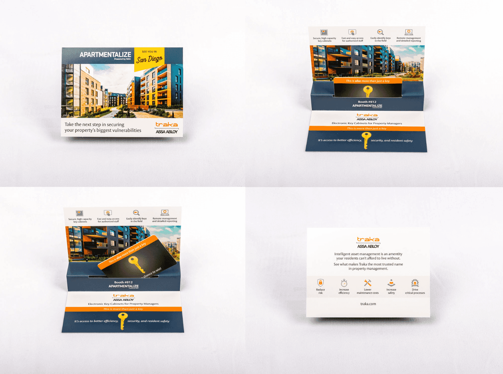
This month’s Design of the Month is Traka Assa Abloy’s Step Pop Card Holder. Traka is a leader in the intelligent access solutions category. They pride themselves on having an intelligent key management solution and help businesses audit the use of every single one of their keys.

When they signed up to vend at a trade show, they knew they wanted to do something different and unique that would get attendees to visit their booth. The Step Pop Card Holder from Red Paper Plane stood out to them because the design itself was interactive and interesting, but also included a removable card which Traka took full advantage of. Attendees could bring the card to the Traka booth for a chance to win an incredible prize, and the card also served as a “ticket” to their cocktail hour event.
Heather Fraser, Marketing Manager at Traka said, “We consider the piece a success as attendees came to us throughout the event explaining we were the only company that sent them anything through the mail. They remembered us, and that was certainly a goal. To be unforgettable at the show.”
